
Even the most thoughtful designer, dedicated to human-centered design, is a little bit shallow. We like our products to have all the elements of visual appeal: organization, cleanliness, structure, etc. Whatever the product does, making it look good makes its actual function feel so much better. Our clients, customers, and employers like aesthetics too: visually appealing websites, for example, are much more likely to make users linger.
For UX professionals designing for the digital media, visuals are doubly important. The digital realm is seen much more than it is heard, touched, tasted, or smelled (though perhaps this technology might change that). Visuals are, without question, important in constructing meaningful and efficient user experiences. But they aren’t everything — and they don’t have to be the foundation upon which everything else is built, either. After all, experiences are more than what we see: they are who we talked to, what we tasted, how comfortable we were, and what smells, unpleasant or irresistible, we were exposed to.
User experience doesn’t have to be a visuals-first field. With the growing ability of digital technology to understand to our spoken requests and adapt their own responses, there is room in digital user experience for more audio-first products, whose user interfaces are audio-centered, rather than visual.
An excellent example of designing an audio-centered user experience are the many iterations of the home and mobile AI systems from Google, Amazon, and Apple. Under ideal circumstances, these systems are activated with a key word or phrase; from there, information the user would normally have to search for from a web browser can be requested out loud. After the user voices their request, the AI system pauses. It then gives a response relevant to the user’s request, and silences itself unless another spoken request from the user is given.
When we break this interaction down, the detail put into designing audio-focused user experiences becomes more apparent. Like visual design, audio design is not only about what is present, but what is absent. The pause before the system’s response, for example, is an intentional and crucial part of the AI and the user’s interaction. The system may actually need time to process the request and its own response, but the pause also serves to make the interaction more conversation-like and more comfortable to the user. An immediate response from the AI system would be jarring; if the pause is too long, the user begins to wonder is the system is still online. It’s easy to forget how much sound can give a space dimension, and how unfamiliar sound (or absence of sound) can make us feel insecure.
There’s also a lot to be said (and that already has been said) about the gender and tone that most AI voices seem to have. It’s not coincidence that most AIs have cool, female voices. An effort to find genderless-sounding AI is underway, but balancing gender fluidity with users’ preconceptions of what AI assistants should sound like is a tricky line to walk. This is to say nothing of the difficulty of programming human-sounding shifts in tone and emotion into a robot’s speech patterns that make audio interactions more fluid and natural.
The user experience described above is also under the ideal circumstances. If the user is in a noisy environment or too far away, their AI system may not hear them. If the system mistakenly provides the wrong information, it will not be able to hear the user’s requests to stop speaking over its own audio. Spoken requests for volume adjustment may fall on the system’s deaf ears if it already playing something too loud.
Perhaps a way to improve audio-centered user interfaces is to augment their interactivity with help from another sense: touch. Our phones already give us tactile reminders that we are receiving messages or calls: vibration. Another often-overlooked source of haptic design comes from the gaming world: game controllers, and perhaps most notably, the Nintendo Switch, have pioneered pairing haptic elements with audio and visual design.
Recently, our UX team (Team Vanguard) at NYU was tasked by Microsoft with creating a device that makes the deskless workplace more accessible. Our design for a haptic/sonic wearable navigation device used several matrices (see below) that combine sonic and haptic feedback in order to guide users around a space.
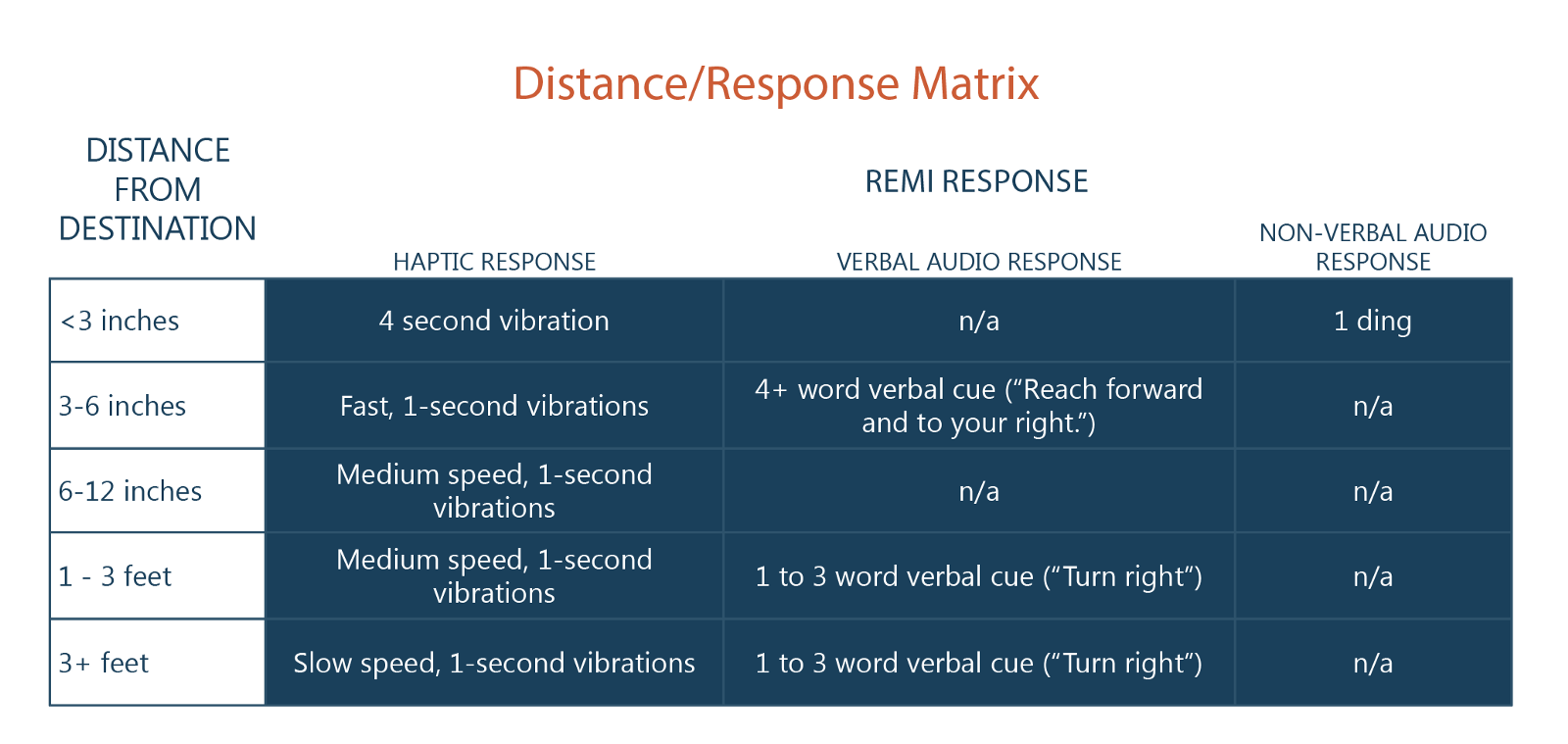
The Distance/Response Matrix for our wearable navigation device, REMI (Remote Epicurean Manual Intelligence)
The Distance/Response Matrix shows what our device’s particular responses are at certain distances. From further away, the device gives the user less frequent vibrations and 1–3 word verbal cues. When users start getting closer to their requested destination, the device speeds up the frequency of the vibrations. Once the user is within 6 inches of their destination, the device gives them rapid vibrations and verbal cues indicating where they should extend their arm. The device gives the user a confirming “ding!” sound when they are 3 inches or fewer away from their destination.
This matrix, while far from perfect, is intended to bridge the gap between two sensory experiences that don’t use a traditional visual user interface. It is the result of extensive user testing responses and iterations on a bracelet-like wearable.